
Making holiday meal ordering clearer and efficient
Making holiday meal ordering clearer and efficient
Making holiday meal ordering clearer and efficient
Project Tags:
Project Tags:
Project Tags:
Product Design
Product Design
Product Design
User Research
User Research
User Research
B2C
B2C
B2C
Project Overview:
Zippy’s Meals to Go is a seasonal ordering experience tailored for customers looking to reserve pre-made holiday meal packages for Thanksgiving, Christmas, and New Year’s. I was one of two product designers on the team
I led the end-to-end design and research efforts to understand user needs and make improvements to the overall user journey.
My Role
Product Designer
My Role
Product Designer
My Role
Product Designer
My Role
Product Designer
Team Structure
2 Product Designers
2 Software Engineers
1 Product Manager
Team Structure
2 Product Designers
2 Software Engineers
1 Product Manager
Team Structure
2 Product Designers
2 Software Engineers
1 Product Manager
Team Structure
2 Product Designers, 2 Software Engineers, 1 Product Manager
Timeline
March - June 2025
(3 Months)
Timeline
March - June 2025
(3 Months)
Timeline
March - June 2025
(3 Months)
Timeline
March - June 2025 (3 Months)
Tools Used
Figma, FigJam, Illustrator, Photoshop, Google Meets, Notion
Tools Used
Figma, FigJam, Illustrator, Photoshop, Google Meets, Notion
Tools Used
Figma, FigJam, Illustrator, Photoshop, Google Meets, Notion
Tools Used
Figma, FigJam, Illustrator, Photoshop, Google Meets, Notion
Impact at a Glance
Impact at a Glance
Impact at a Glance
50% faster ordering
50% faster ordering
50% faster ordering
Reduced completion time from 20+ minutes to approximately 10 minutes
Reduced completion time from 20+ minutes to approximately 10 minutes
Reduced completion time from 20+ minutes to approximately 10 minutes
Reduced completion time from 20+ minutes to approximately 10 minutes
97% fewer options
97% fewer options
97% fewer options
Streamlined from 58 date options to 2 actual choices
Streamlined from 58 date options to 2 actual choices
Streamlined from 58 date options to 2 actual choices
Streamlined from 58 date options to 2 actual choices
Launched Fall 2025
Launched Fall 2025
Launched Fall 2025
Fully integrated within the Zippy's system with responsive design across devices
Fully integrated within the Zippy's system with responsive design across devices
Fully integrated within the Zippy's system with responsive design across devices
Fully integrated within the Zippy's system with responsive design across devices
The Problem
The Problem
The Problem
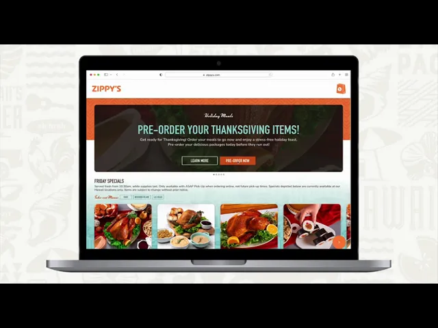
During peak holiday season, Zippy's was losing digital orders to phone calls because the ordering experience was so fragmented and confusing that middle-aged and elderly customers (the majority demographic) would rather wait on hold than complete an online order.
During peak holiday season, Zippy's was losing digital orders to phone calls because the ordering experience was so fragmented and confusing that middle-aged and elderly customers (the majority demographic) would rather wait on hold than complete an online order.
During peak holiday season, Zippy's was losing digital orders to phone calls because the ordering experience was so fragmented and confusing that middle-aged and elderly customers (the majority demographic) would rather wait on hold than complete an online order.
During peak holiday season, Zippy's was losing digital orders to phone calls because the ordering experience was so fragmented and confusing that middle-aged and elderly customers (the majority demographic) would rather wait on hold than complete an online order.
20% of all orders required customer support intervention. 75% needed staff walkthrough assistance.
20% of all orders required customer support intervention. 75% needed staff walkthrough assistance.
20% of all orders required customer support intervention. 75% needed staff walkthrough assistance.
20% of all orders required customer support intervention. 75% needed staff walkthrough assistance.
The constraint: Meals to Go ran on a legacy system that couldn't integrate with Zippy's main ordering platform. Every design decision would have to work within Olo (an ordering system with significant technical limitations).
The constraint: Meals to Go ran on a legacy system that couldn't integrate with Zippy's main ordering platform. Every design decision would have to work within Olo (an ordering system with significant technical limitations).
The constraint: Meals to Go ran on a legacy system that couldn't integrate with Zippy's main ordering platform. Every design decision would have to work within Olo (an ordering system with significant technical limitations).
The constraint: Meals to Go ran on a legacy system that couldn't integrate with Zippy's main ordering platform. Every design decision would have to work within Olo (an ordering system with significant technical limitations).
After
Before
After
Before
Before/After (Mobile): Ordering flow of Meals to Go
Before/After (Mobile): Ordering flow of Meals to Go
Before/After (Mobile): Ordering flow of Meals to Go
Before/After (Mobile): Ordering flow of Meals to Go
System Painpoints
System Painpoints
System Painpoints
We inherited the 'Olo system, Zippy's legacy workspace that their team utilized for both speciality orders like Meals to Go as well as their normal restaurant ordering.
We had to work around the following technical constraints:
58 date options displayed, but only 2 were actually available: The legacy system pulled all future dates without filtering for Meals to Go availability
No package availability shown upfront: Customers drilled down three levels before discovering unavailability
Small, unclear touch points: Overwhelming interface for users with lower digital fluency

The Meals to Go experience ran under the 'Olo system and the changed URLs yearly
The Meals to Go experience ran under the 'Olo system and the changed URLs yearly
The Meals to Go experience ran under the 'Olo system and the changed URLs yearly
The Meals to Go experience ran under the 'Olo system and the changed URLs yearly
Who was affected?
Who was affected?
Who was affected?
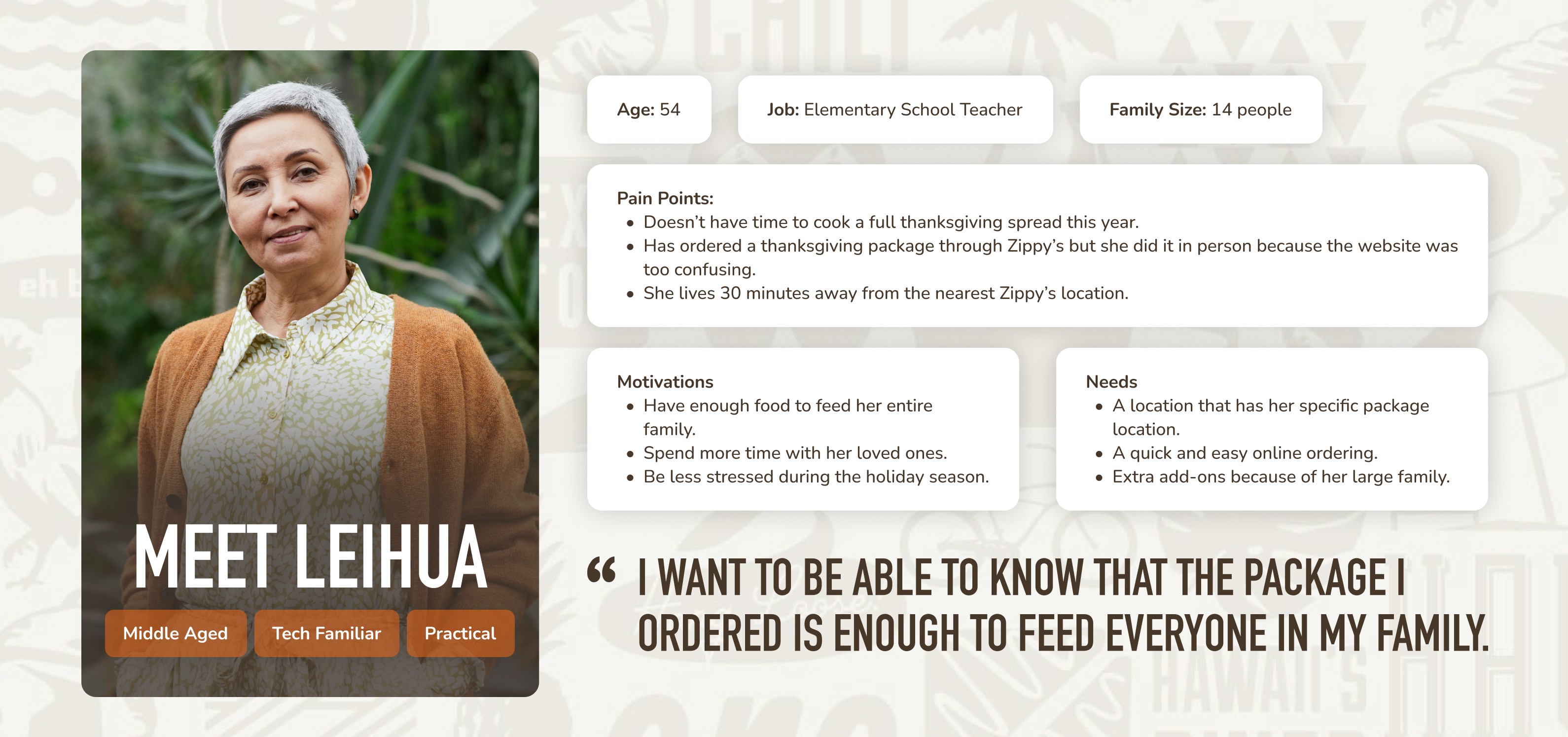
Through stakeholder interviews across five departments (marketing, operations, digital experience, IT, customer service), we learned the primary users were ages 45-72, often tech-familiar but time-strapped, and needed confidence-building over novelty.
Let's meet Leihua: She represents thousands of local customers who gave up on the digital experience due to a confusing digital experience.

What competitors did better
What competitors did better
What competitors did better
I co-led the SWOT analysis of 8 regional and national competitors offering similar holiday meal packages. Leaders in this space emphasized simplified pickup flows and package clarity upfront.
Notable design considerations included:
Metro Diner: "Most ordered" indicators that guided customer choices based on popularity.
Whole Foods: Integrated holiday ordering within their main system. No separate site, no broken links year over year.
Honeybaked Ham: Larger, clearer touch points for package selection. Easier to tap, easier to scan.


Discovery + Research
Discovery + Research
Discovery + Research
Rather than jumping into redesign, we needed to understand whether this was a UI problem or a fundamental experience architecture problem.
I led stakeholder interviews focused on three areas:
User pain points observed by frontline staff
Implementation constraints and internal misalignments
Technical gaps and system limitations
The PM and engineers ran parallel interviews for their domains (business goals, technical feasibility). The information that emerged based on these interviews surprised us.
What we learned
What we learned
What we learned
Each holiday had different package types.
Thanksgiving, Christmas, and New Year's each offered unique meals. We needed flexible architecture, not a one-size-fits-all solution.
Each holiday had different package types.
Thanksgiving, Christmas, and New Year's each offered unique meals. We needed flexible architecture, not a one-size-fits-all solution.
Each holiday had different package types.
Thanksgiving, Christmas, and New Year's each offered unique meals. We needed flexible architecture, not a one-size-fits-all solution.
Each holiday had different package types.
Thanksgiving, Christmas, and New Year's each offered unique meals. We needed flexible architecture, not a one-size-fits-all solution.
Every department cited date/time selection as the primary pain point.
Universal agreement that this was breaking the experience. Multiple departments reported that this was a primary issue that needed fixing.
Every department cited date/time selection as the primary pain point.
Universal agreement that this was breaking the experience. Multiple departments reported that this was a primary issue that needed fixing.
Every department cited date/time selection as the primary pain point.
Universal agreement that this was breaking the experience. Multiple departments reported that this was a primary issue that needed fixing.
Every department cited date/time selection as the primary pain point.
Universal agreement that this was breaking the experience. Multiple departments reported that this was a primary issue that needed fixing.
The legacy system meant designing within Olo's constraints.
We had to rule out indicator features like dynamic inventory indicators ("Most Popular," "X packages left") because these weren't technically possible within the system.
The legacy system meant designing within Olo's constraints.
We had to rule out indicator features like dynamic inventory indicators ("Most Popular," "X packages left") because these weren't technically possible within the system.
The legacy system meant designing within Olo's constraints.
We had to rule out indicator features like dynamic inventory indicators ("Most Popular," "X packages left") because these weren't technically possible within the system.
The legacy system meant designing within Olo's constraints.
We had to rule out indicator features like dynamic inventory indicators ("Most Popular," "X packages left") because these weren't technically possible within the system.


Strategic Reframe
Strategic Reframe
Strategic Reframe
From "build to redesign" to "build to establish trust"
This shifted our focus from "How do we make ordering faster?" to "How do we build an experience trustworthy enough to become the preferred choice?"
From "build to redesign" to "build to establish trust"
This shifted our focus from "How do we make ordering faster?" to "How do we build an experience trustworthy enough to become the preferred choice?"
From "build to redesign" to "build to establish trust"
This shifted our focus from "How do we make ordering faster?" to "How do we build an experience trustworthy enough to become the preferred choice?"
From "build to redesign" to "build to establish trust"
This shifted our focus from "How do we make ordering faster?" to "How do we build an experience trustworthy enough to become the preferred choice?"
My co-designer and I synthesized findings and identified three critical focus areas:
Date/time picker: the universal pain point across all departments
Location cards: where package availability needed to surface upfront
Package details: where comparison and clarity mattered most for confident decisions
We presented our synthesis to the internal team, received buy-in, then validated with Zippy's stakeholders. These became our core design focus.

Design System Creation
Design System Creation
Design System Creation
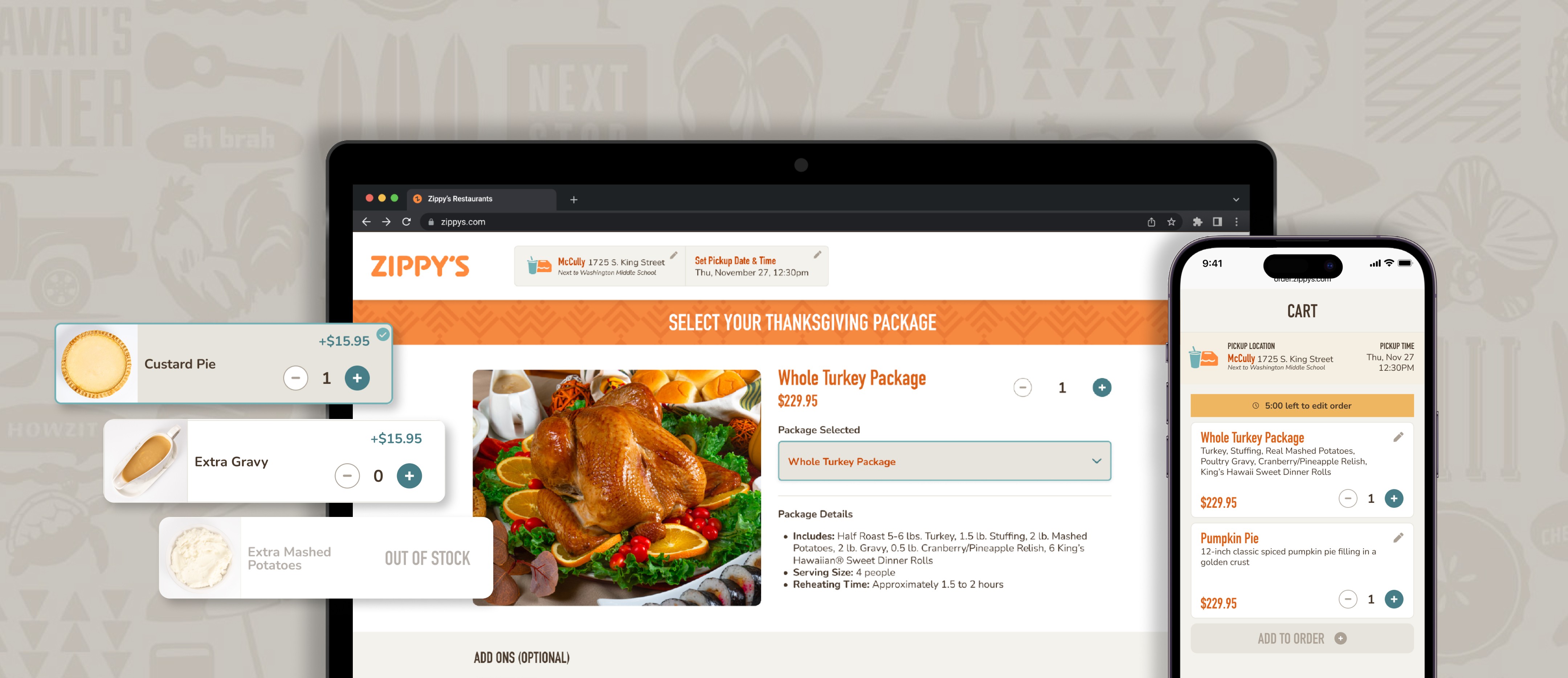
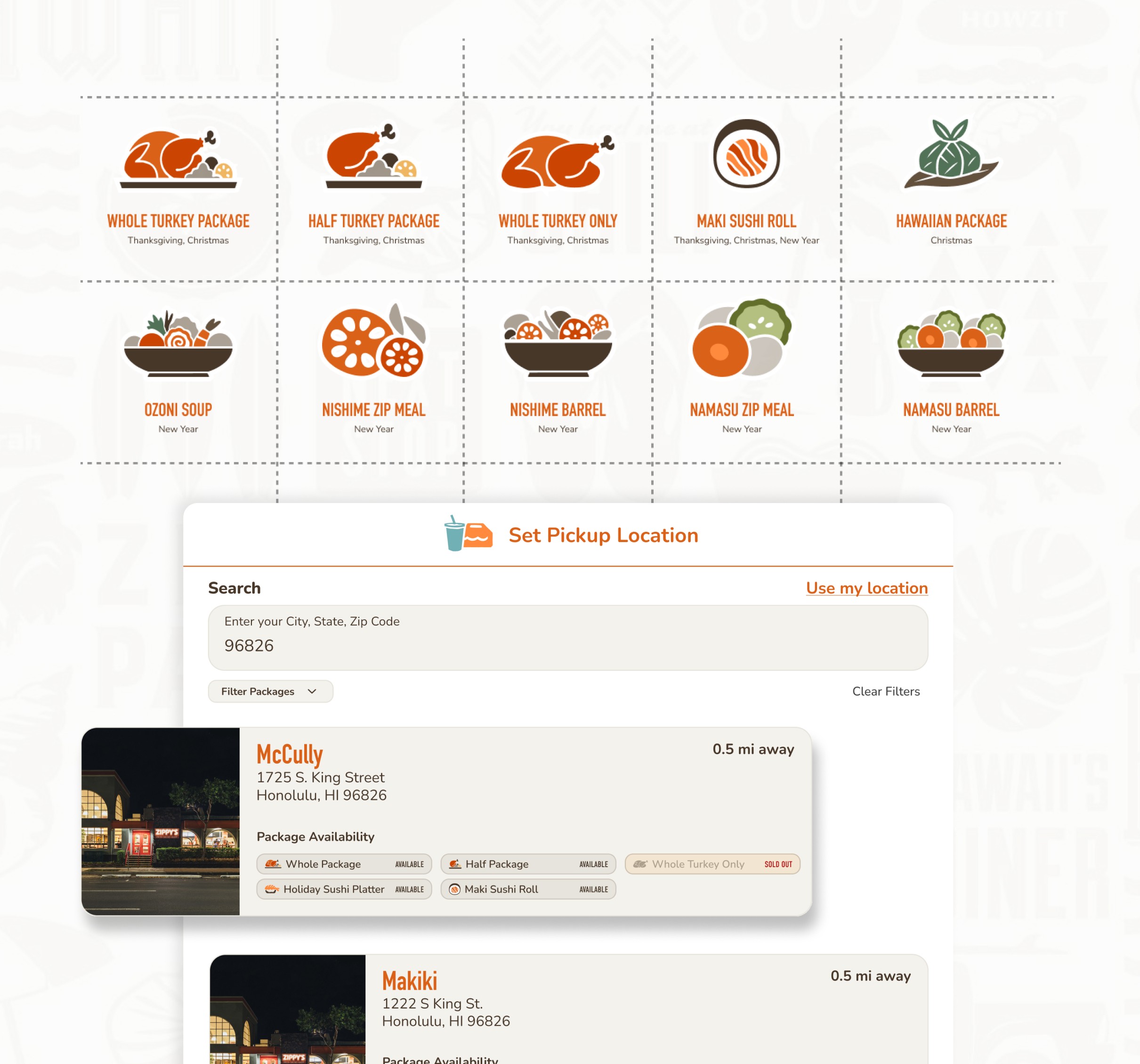
Before we could solve the package availability problem, I needed to build the visual language to support it. Zippy's design system had one icon: a sushi icon for their regular ordering menu. They had no visual language for Meals to Go packages.
The Customer Services department shared that about 1/4 of customer calls received were regarding package type availability. This led the executive team requesting that package availability be shown directly on location cards so customers know what's offered before selecting a location.
Building a custom icon system
Building a custom icon system
Building a custom icon system
I designed 10 new icons representing each package across Thanksgiving, New Year's, and Christmas.
Each icon needed to meet multiple requirements simultaneously:
Match the existing design system: Fit stylistically with Zippy's existing sushi icon (consistent line weight, level of detail, visual treatment)
Be culturally recognizable: These are meals tied to Hawaiian culture. A laulau icon needed to look like laulau, honoring what these foods mean to the community
Scale across contexts: Desktop, mobile, print materials, social media—needed to work everywhere

Progression from sketch to final design of one of the icons I created
Progression from sketch to final design of one of the icons I created
Progression from sketch to final design of one of the icons I created
Progression from sketch to final design of one of the icons I created
Creating these icons wasn't just visual design, it required systems thinking. These icons would become part of Zippy's design language, reusable across future seasonal campaigns.
Creating these icons wasn't just visual design, it required systems thinking. These icons would become part of Zippy's design language, reusable across future seasonal campaigns.
Creating these icons wasn't just visual design, it required systems thinking. These icons would become part of Zippy's design language, reusable across future seasonal campaigns.
Creating these icons wasn't just visual design, it required systems thinking. These icons would become part of Zippy's design language, reusable across future seasonal campaigns.
Design Solutions
Design Solutions
Design Solutions
These are the three core improvements that transformed the ordering experience into something faster, clearer, and more aligned with customer needs. Each solution needed to work within Olo's technical constraints while rebuilding trust.
These are the three core improvements that transformed the ordering experience into something faster, clearer, and more aligned with customer needs. Each solution needed to work within Olo's technical constraints while rebuilding trust.
These are the three core improvements that transformed the ordering experience into something faster, clearer, and more aligned with customer needs. Each solution needed to work within Olo's technical constraints while rebuilding trust.
These are the three core improvements that transformed the ordering experience into something faster, clearer, and more aligned with customer needs. Each solution needed to work within Olo's technical constraints while rebuilding trust.
SOLUTION 01
SOLUTION 01
SOLUTION 01
Consolidating the Date/Time Experience
Consolidating the Date/Time Experience
Consolidating the Date/Time Experience
The legacy system's 58-date display was the universal pain point across all departments—marketing, operations, IT, and customer service all cited it as breaking the experience. Eliminating this chaos became our first priority.
The legacy system's 58-date display was the universal pain point across all departments—marketing, operations, IT, and customer service all cited it as breaking the experience. Eliminating this chaos became our first priority.
The legacy system's 58-date display was the universal pain point across all departments—marketing, operations, IT, and customer service all cited it as breaking the experience. Eliminating this chaos became our first priority.
The legacy system's 58-date display was the universal pain point across all departments—marketing, operations, IT, and customer service all cited it as breaking the experience. Eliminating this chaos became our first priority.
The Problem
The Problem
The Problem
The Problem
The legacy system displayed 58 date options when only 2 were actually available (day-before and day-of pickup). This created decision paralysis and reinforced distrust.
The legacy system displayed 58 date options when only 2 were actually available (day-before and day-of pickup). This created decision paralysis and reinforced distrust.
The legacy system displayed 58 date options when only 2 were actually available (day-before and day-of pickup). This created decision paralysis and reinforced distrust.
The legacy system displayed 58 date options when only 2 were actually available (day-before and day-of pickup). This created decision paralysis and reinforced distrust.
After
Before
After
Before
The Solution
The Solution
The Solution
The Solution
We redesigned the date picker to show only the 2 relevant options in clear visual tiles to eliminate irrelevant options that were creating decision paralysis. After testing revealed confusion with a four-column layout, we moved to three columns. On mobile, it collapsed to a single column.
We redesigned the date picker to show only the 2 relevant options in clear visual tiles to eliminate irrelevant options that were creating decision paralysis. After testing revealed confusion with a four-column layout, we moved to three columns. On mobile, it collapsed to a single column.
We redesigned the date picker to show only the 2 relevant options in clear visual tiles to eliminate irrelevant options that were creating decision paralysis. After testing revealed confusion with a four-column layout, we moved to three columns. On mobile, it collapsed to a single column.
We redesigned the date picker to show only the 2 relevant options in clear visual tiles to eliminate irrelevant options that were creating decision paralysis. After testing revealed confusion with a four-column layout, we moved to three columns. On mobile, it collapsed to a single column.
SOLUTION 02
SOLUTION 02
SOLUTION 02
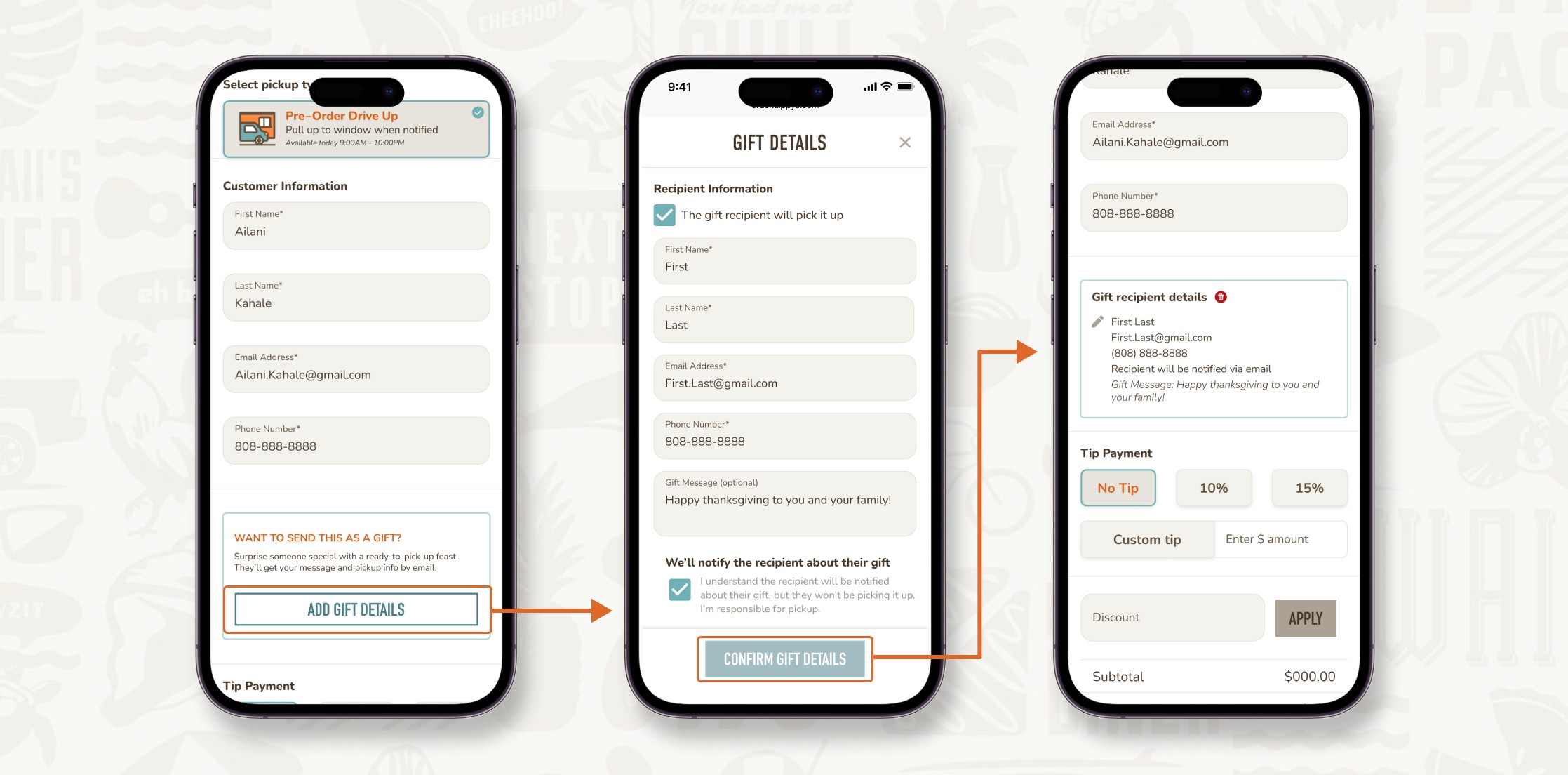
Surfacing Package Availability
Surfacing Package Availability
Surfacing Package Availability
For users like Leihua who live 30 minutes from the nearest Zippy's, discovering package unavailability after selecting a location meant wasted time and eroded trust. We needed to make this information visible upfront.
For users like Leihua who live 30 minutes from the nearest Zippy's, discovering package unavailability after selecting a location meant wasted time and eroded trust. We needed to make this information visible upfront.
For users like Leihua who live 30 minutes from the nearest Zippy's, discovering package unavailability after selecting a location meant wasted time and eroded trust. We needed to make this information visible upfront.
For users like Leihua who live 30 minutes from the nearest Zippy's, discovering package unavailability after selecting a location meant wasted time and eroded trust. We needed to make this information visible upfront.
The Problem
The Problem
The Problem
The Problem
Customers couldn't see what packages were available until they drilled down three levels. This led to wasted trips and eroded trust.
Customers couldn't see what packages were available until they drilled down three levels. This led to wasted trips and eroded trust.
Customers couldn't see what packages were available until they drilled down three levels. This led to wasted trips and eroded trust.
Customers couldn't see what packages were available until they drilled down three levels. This led to wasted trips and eroded trust.
After
Before
After
Before
The Solution
The Solution
The Solution
The Solution
Using the custom icon system I created, we displayed package availability as tags on location cards, making it visible at a glance. Each location card now showed which packages were available before users committed to a selection
Using the custom icon system I created, we displayed package availability as tags on location cards, making it visible at a glance. Each location card now showed which packages were available before users committed to a selection
Using the custom icon system I created, we displayed package availability as tags on location cards, making it visible at a glance. Each location card now showed which packages were available before users committed to a selection
Using the custom icon system I created, we displayed package availability as tags on location cards, making it visible at a glance. Each location card now showed which packages were available before users committed to a selection
SOLUTION 03
SOLUTION 03
SOLUTION 03
Streamlining Package Comparison
Streamlining Package Comparison
Streamlining Package Comparison
Users needed to compare package contents to make confident decisions, but the dense layout and back-and-forth navigation made this frustratingly slow.
Users needed to compare package contents to make confident decisions, but the dense layout and back-and-forth navigation made this frustratingly slow.
Users needed to compare package contents to make confident decisions, but the dense layout and back-and-forth navigation made this frustratingly slow.
Users needed to compare package contents to make confident decisions, but the dense layout and back-and-forth navigation made this frustratingly slow.
The Problem
The Problem
The Problem
The Problem
The package details page was dense and hard to scan. Users needed to navigate back and forth to compare packages.
The package details page was dense and hard to scan. Users needed to navigate back and forth to compare packages.
The package details page was dense and hard to scan. Users needed to navigate back and forth to compare packages.
The package details page was dense and hard to scan. Users needed to navigate back and forth to compare packages.
After
Before
After
Before
The Solution
The Solution
The Solution
The Solution
We redesigned with better visual hierarchy, larger touchpoints for add-ons, and clearer groupings.
We redesigned with better visual hierarchy, larger touchpoints for add-ons, and clearer groupings.
We redesigned with better visual hierarchy, larger touchpoints for add-ons, and clearer groupings.
We redesigned with better visual hierarchy, larger touchpoints for add-ons, and clearer groupings.
Test + Refine
Test + Refine
Test + Refine
Midpoint testing with real users
Midpoint testing with real users
Midpoint testing with real users
We tested with a focused group of 12 participants recruited through Piʻikū Co. and Zippy's. Participants include community members and actual customers, spanning ages 20s-70s (students, professionals, retirees, Zippy's executives).
We tested with a focused group of 12 participants recruited through Piʻikū Co. and Zippy's. Participants include community members and actual customers, spanning ages 20s-70s (students, professionals, retirees, Zippy's executives).
We tested with a focused group of 12 participants recruited through Piʻikū Co. and Zippy's. Participants include community members and actual customers, spanning ages 20s-70s (students, professionals, retirees, Zippy's executives).
We tested with a focused group of 12 participants recruited through Piʻikū Co. and Zippy's. Participants include community members and actual customers, spanning ages 20s-70s (students, professionals, retirees, Zippy's executives).
The validation
The validation
The validation
We narrowed to two options for midpoint testing with 12 users:
Option A: Text-based with supporting icons
Option B: Icon-based with minimal text
We narrowed to two options for midpoint testing with 12 users:
Option A: Text-based with supporting icons
Option B: Icon-based with minimal text
We narrowed to two options for midpoint testing with 12 users:
Option A: Text-based with supporting icons
Option B: Icon-based with minimal text
We narrowed to two options for midpoint testing with 12 users:
Option A: Text-based with supporting icons
Option B: Icon-based with minimal text
100% task completion rate
Every participant completed the full flow with minimal to no issues.
100% task completion rate
Every participant completed the full flow with minimal to no issues.
100% task completion rate
Every participant completed the full flow with minimal to no issues.
100% task completion rate
Every participant completed the full flow with minimal to no issues.
Sub-10-minute completion time
Compared to the previous 20+ minutes (and 20% of orders requiring support), this was meaningful improvement.
Sub-10-minute completion time
Compared to the previous 20+ minutes (and 20% of orders requiring support), this was meaningful improvement.
Sub-10-minute completion time
Compared to the previous 20+ minutes (and 20% of orders requiring support), this was meaningful improvement.
Sub-10-minute completion time
Compared to the previous 20+ minutes (and 20% of orders requiring support), this was meaningful improvement.

Observing Aunty Ruthie, a longtime Meals To Go customer, through the new design system during midpoint.
Observing Aunty Ruthie, a longtime Meals To Go customer, through the new design system during midpoint.
Observing Aunty Ruthie, a longtime Meals To Go customer, through the new design system during midpoint.
Observing Aunty Ruthie, a longtime Meals To Go customer, through the new design system during midpoint.
What surprised us:
We expected friction points that didn't materialize. By midpoint, we'd already refined enough that the core flow was solid. The package details page still used older design patterns, but it didn't block completion.
This validated we were heading in the right direction. Further refinements would make it even stronger.
What we changed immediately based on feedback
What we changed immediately based on feedback
What we changed immediately based on feedback
1. Filter placement felt disconnected: Dot voting revealed filters felt separate from the experience. We integrated them more naturally through the modal approach described earlier.
2. Map took too much space: The map was inherited from Zippy's regular ordering system. Testing showed users ignored it. They focused on location cards instead. To solve this, we made it collapsible, maximizing screen real estate for location listings while keeping it as an optional tool.
3. Time selection confusion: Moved from four-column to three-column layout to eliminate tab ambiguity.

Dot voting exercise helped to determine priorities to guide the next phase of design refinement. Session led by Kim Davidson, Pi'ikū Co. Program Director.
Dot voting exercise helped to determine priorities to guide the next phase of design refinement. Session led by Kim Davidson, Pi'ikū Co. Program Director.
Dot voting exercise helped to determine priorities to guide the next phase of design refinement. Session led by Kim Davidson, Pi'ikū Co. Program Director.
Dot voting exercise helped to determine priorities to guide the next phase of design refinement. Session led by Kim Davidson, Pi'ikū Co. Program Director.
Final Outcome
Final Outcome
Final Outcome
What shipped
What shipped
What shipped
The redesigned Meals to Go experience launched in September 2025, fully integrated into Zippy's ordering system with responsive design across devices. The Thanksgiving flow went live first, which you can view below.
The redesigned Meals to Go experience launched in September 2025, fully integrated into Zippy's ordering system with responsive design across devices. The Thanksgiving flow went live first, which you can view below.
The redesigned Meals to Go experience launched in September 2025, fully integrated into Zippy's ordering system with responsive design across devices. The Thanksgiving flow went live first, which you can view below.
The redesigned Meals to Go experience launched in September 2025, fully integrated into Zippy's ordering system with responsive design across devices. The Thanksgiving flow went live first, which you can view below.
Next Steps
Next Steps
Next Steps
While our timeline for this project was limited, our team created a resource document for the Zippy’s team that outlined future areas that explores additional features beyond the MVP as they continue building.
Here are some of the more notable recommendations of features within the document:
While our timeline for this project was limited, our team created a resource document for the Zippy’s team that outlined future areas that explores additional features beyond the MVP as they continue building.
Here are some of the more notable recommendations of features within the document:
While our timeline for this project was limited, our team created a resource document for the Zippy’s team that outlined future areas that explores additional features beyond the MVP as they continue building.
Here are some of the more notable recommendations of features within the document:
While our timeline for this project was limited, our team created a resource document for the Zippy’s team that outlined future areas that explores additional features beyond the MVP as they continue building.
Here are some of the more notable recommendations of features within the document:
RECOMMENDATION 01
RECOMMENDATION 01
RECOMMENDATION 01
Order Changes After Checkout
Order Changes After Checkout
Order Changes After Checkout
Customer service reported frequent calls from users unable to edit orders after checkout. The new timed modification feature aims to give users the opportunity modify orders in the event of mistakes, reducing customer support calls and manual cancellations by the customer services department.
Customer service reported frequent calls from users unable to edit orders after checkout. The new timed modification feature aims to give users the opportunity modify orders in the event of mistakes, reducing customer support calls and manual cancellations by the customer services department.
Customer service reported frequent calls from users unable to edit orders after checkout. The new timed modification feature aims to give users the opportunity modify orders in the event of mistakes, reducing customer support calls and manual cancellations by the customer services department.
Customer service reported frequent calls from users unable to edit orders after checkout. The new timed modification feature aims to give users the opportunity modify orders in the event of mistakes, reducing customer support calls and manual cancellations by the customer services department.

RECOMMENDATION 02
RECOMMENDATION 02
RECOMMENDATION 02
Future Gifting Feature
Future Gifting Feature
Future Gifting Feature
Gifting was a popular request identified in meetings with the internal Zippy’s teams, as many customers wanted to send holiday packages to friends and family.
Gifting was a popular request identified in meetings with the internal Zippy’s teams, as many customers wanted to send holiday packages to friends and family.
Gifting was a popular request identified in meetings with the internal Zippy’s teams, as many customers wanted to send holiday packages to friends and family.
Gifting was a popular request identified in meetings with the internal Zippy’s teams, as many customers wanted to send holiday packages to friends and family.
RECOMMENDATION 03
RECOMMENDATION 03
RECOMMENDATION 03
Enhanced Package Clarity
Enhanced Package Clarity
Enhanced Package Clarity
Further refining package groupings and adding inventory indicators for faster, more confident choices.
Further refining package groupings and adding inventory indicators for faster, more confident choices.
Further refining package groupings and adding inventory indicators for faster, more confident choices.
Further refining package groupings and adding inventory indicators for faster, more confident choices.

Reflection
Reflection
Reflection
What made this project complex
What made this project complex
We quickly learned that in addition to redesigning the experience, we were also rebuilding trust with a demographic that had learned to avoid the digital experience.
Every design decision needed to balance competing forces:
Technical constraints: realities that lived within Olo's limitations
User needs: balancing clarity for elderly users vs. efficiency for younger users
Business integration: proving digital could work before the September launch
Cultural integrity: embedding community values and local traditions into design decisions that directly reflect the local landscape.
This experience helped me balance vision with reality, move with intention, and design in a way that connects deeply with people.
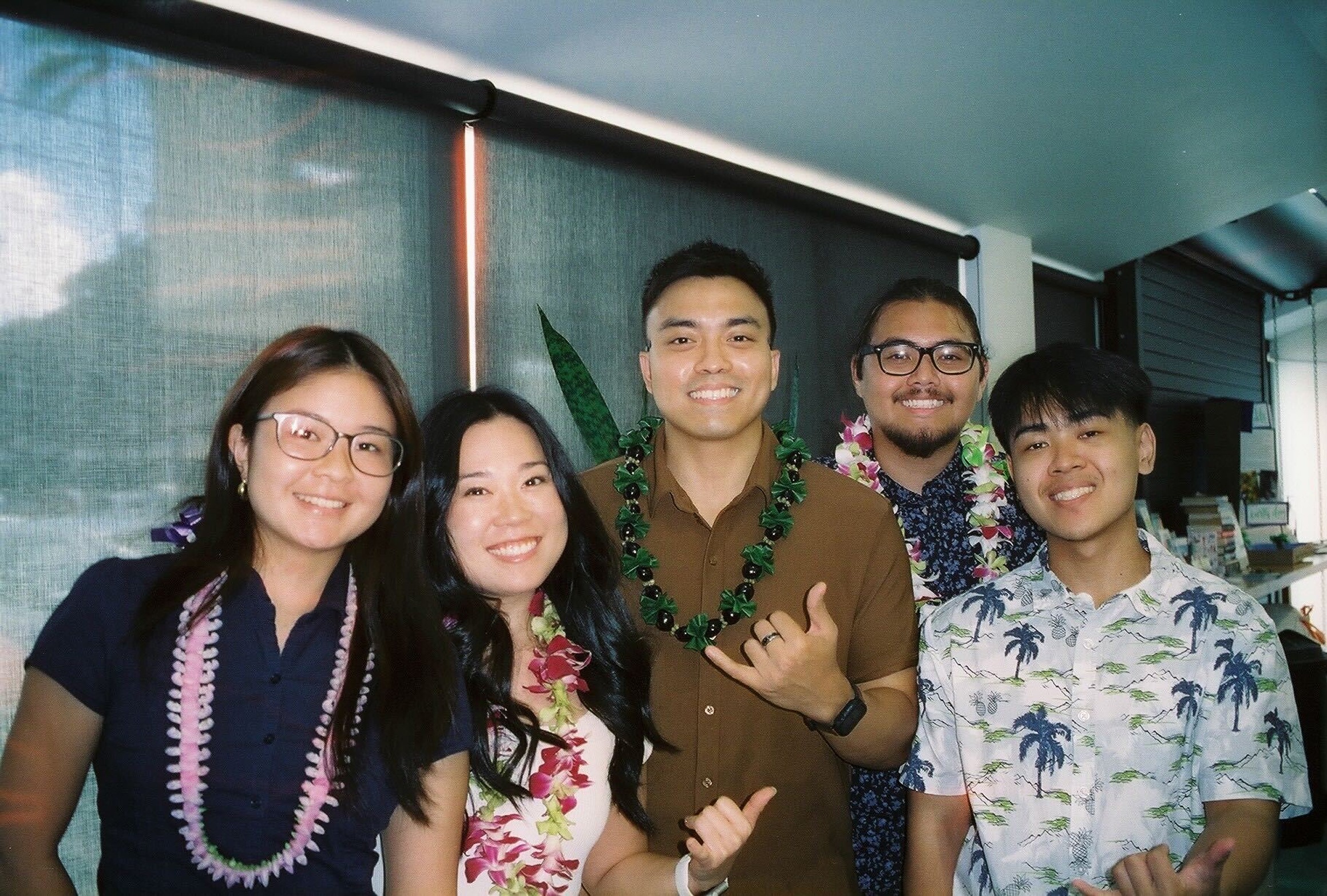
My Meals to Go team members and I during our final product hō'ike (showcase).
My Meals to Go team members and I during our final product hō'ike (showcase).
My Meals to Go team members and I during our final product hō'ike (showcase).
My Meals to Go team members and I during our final product hō'ike (showcase).
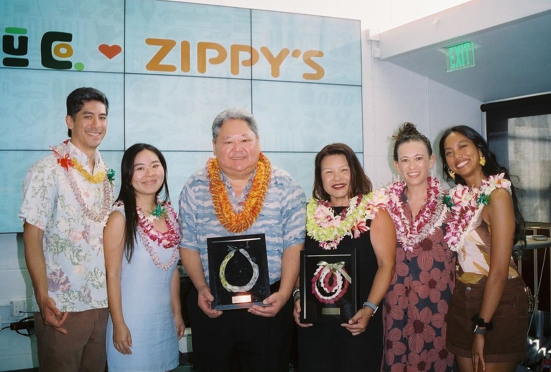
Zippy's CEO Jason Higa, Digital Experiences Manager Arleen Fernando (center), and Pi'ikū core team.
Zippy's CEO Jason Higa, Digital Experiences Manager Arleen Fernando (center), and Pi'ikū core team.
Zippy's CEO Jason Higa, Digital Experiences Manager Arleen Fernando (center), and Pi'ikū core team.
Zippy's CEO Jason Higa, Digital Experiences Manager Arleen Fernando (center), and Pi'ikū core team.
please feel free to browse other case studies below!
please feel free to browse other case studies below!
please feel free to browse other
case studies below!
More case studies
More case studies
More case studies


open to
open to
Thanks for being here! If you want to work on a project together, please feel free to connect with me below.
Thanks for being here! If you want to work on a project together, please feel free to connect with me below.
Site designed by me + built in framer +
fueled by an açai bowl (with extra granola)
Copyright 2026 © Josh Koh
Product + Visual Design