

Resolving a fragmented archival research experience
Resolving a fragmented archival research experience
Resolving a fragmented archival research experience
Project Tags:
Project Tags:
Project Tags:
Government UX
Government UX
Government UX
User Research
User Research
User Research
Design Strategy
Design Strategy
Design Strategy
Project Overview:
The Papakilo Database is an online repository created by the Office of Hawaiian Affairs (OHA) to serve as a valuable resource for regulatory agencies, OHA’s Native Hawaiian beneficiaries, and the general public. The database is accessible through web and mobile interfaces.
I identified critical usability barriers within the dashboard serving Native Hawaiian beneficiaries, with potential to reduce overall search time by 80%.
My Role
Multimedia / UX Designer
My Role
Multimedia / UX Designer
My Role
Multimedia / UX Designer
My Role
Multimedia / UX Designer
Timeline
Sept - Nov 2024
(3 months)
Timeline
March - June 2025 (3 Months)
Timeline
Sept - Nov 2024
(3 months)
Timeline
Sept - Nov 2024
(3 months)
Tools Used
Figma, Photoshop, Illustrator, Zoom, Google Sheets
Tools Used
Figma, Photoshop, Illustrator, Zoom, Google Sheets
Tools Used
Figma, Photoshop, Illustrator, Zoom, Google Sheets
Tools Used
Figma, Photoshop, Illustrator, Zoom, Google Sheets
The Problem
The Problem
The Problem
While working at the Office of Hawaiian Affairs, I identified critical usability barriers in our Papakilo Database which is a legacy system housing nearly 1 million records of Native Hawaiian history and cultural knowledge.
While working at the Office of Hawaiian Affairs, I identified critical usability barriers in our Papakilo Database which is a legacy system housing nearly 1 million records of Native Hawaiian history and cultural knowledge.
While working at the Office of Hawaiian Affairs, I identified critical usability barriers in our Papakilo Database which is a legacy system housing nearly 1 million records of Native Hawaiian history and cultural knowledge.
While working at the Office of Hawaiian Affairs, I identified critical usability barriers in our Papakilo Database which is a legacy system housing nearly 1 million records of Native Hawaiian history and cultural knowledge.
The reality:
Four different search paths created decision paralysis. Search by collection, location, newspaper, advanced search
No saved searches or search history—every query started from scratch
When people couldn't find what they needed, they abandoned Papakilo for alternative archives
The reality:
Four different search paths created decision paralysis. Search by collection, location, newspaper, advanced search
No saved searches or search history—every query started from scratch
When people couldn't find what they needed, they abandoned Papakilo for alternative archives
The reality:
Four different search paths created decision paralysis. Search by collection, location, newspaper, advanced search
No saved searches or search history—every query started from scratch
When people couldn't find what they needed, they abandoned Papakilo for alternative archives
The reality:
Four different search paths created decision paralysis. Search by collection, location, newspaper, advanced search
No saved searches or search history—every query started from scratch
When people couldn't find what they needed, they abandoned Papakilo for alternative archives
Luci Meyer, OHA's cultural archivist: "There's no way to keep track of information. You have to restart the search process every single time."
Luci Meyer, OHA's cultural archivist: "There's no way to keep track of information. You have to restart the search process every single time."
Luci Meyer, OHA's cultural archivist: "There's no way to keep track of information. You have to restart the search process every single time."
Luci Meyer, OHA's cultural archivist: "There's no way to keep track of information. You have to restart the search process every single time."
The organizational context
The organizational context
The organizational context
OHA had no UX function. Our communications team focused on storytelling through photo, video, and print. IT handled hardware and networks, not software design. Papakilo had operated essentially unchanged since 2009.
OHA had no UX function. Our communications team focused on storytelling through photo, video, and print. IT handled hardware and networks, not software design. Papakilo had operated essentially unchanged since 2009.
OHA had no UX function. Our communications team focused on storytelling through photo, video, and print. IT handled hardware and networks, not software design. Papakilo had operated essentially unchanged since 2009.
OHA had no UX function. Our communications team focused on storytelling through photo, video, and print. IT handled hardware and networks, not software design. Papakilo had operated essentially unchanged since 2009.
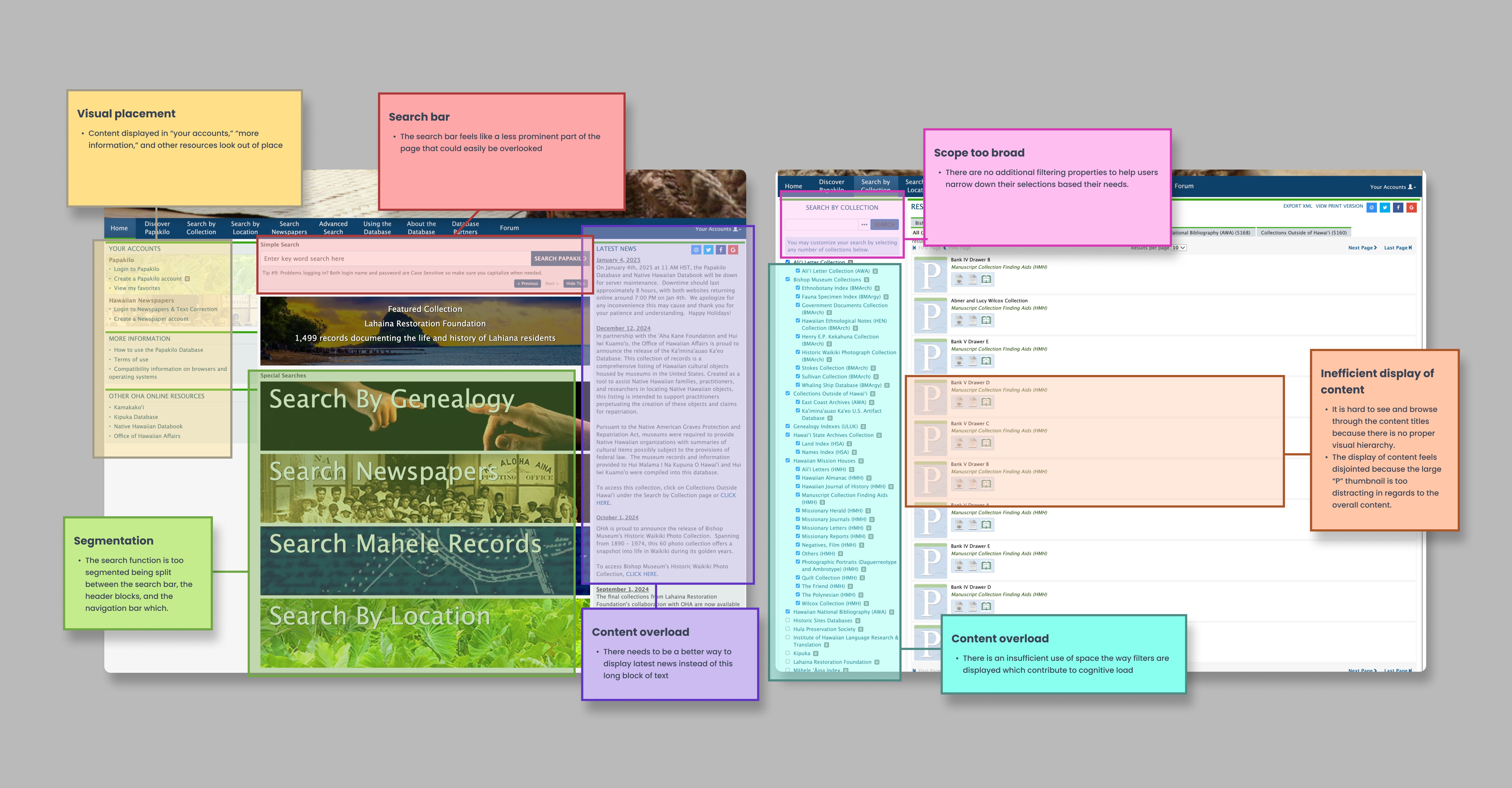
Initial UX audit of key issue areas of homepage and filtered search pages
Initial UX audit of key issue areas of homepage and filtered search pages
Initial UX audit of key issue areas of homepage and filtered search pages
Initial UX audit of key issue areas of homepage and filtered search pages
Research + Insights
Research + Insights
Research + Insights
Understanding who struggles and why
Understanding who struggles and why
Understanding who struggles and why
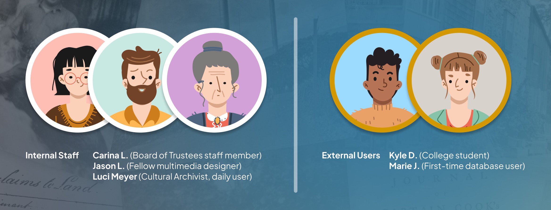
Because archival research is niche, I focused on people with direct ties to Papakilo rather than recruiting broadly to prioritize depth over breadth.
Internal staff (3 people): Luci Meyer (Cultural Archivist, daily user), fellow multimedia designer, OHA Board of Trustees staff member
External users (2 people): College student researching Hawaiian music history, first-time user with no archival background

What users told me
What users told me
What users told me
Luci Meyer (Cultural Archivist): "The site is confusing to use. When you filter by collection, sub-filters appear that no one knows what they mean." Her workaround: Bookmarking individual pages and using Google Books because Papakilo can't maintain search context. Search time within the current system averages 20-25 minutes
College student: "Why are there four different ways to search? Which one gives me the best results?"
First-time user: "I don't know where to start—so many things competing for attention."
The core insight: The problem wasn't just poor UI—it was a mismatch between system structure and how people actually search.
The core insight: The problem wasn't just poor UI—it was a mismatch between system structure and how people actually search.
The core insight: The problem wasn't just poor UI—it was a mismatch between system structure and how people actually search.
The core insight: The problem wasn't just poor UI—it was a mismatch between system structure and how people actually search.
What competitors did better
What competitors did better
What competitors did better
I analyzed four digital archive systems to understand how they structure complex information.
Key patterns observed:
Search is front and center - One clear entry point, not multiple competing paths
Filtering is progressive - Start broad, narrow as needed
Visual hierarchy guides users - Clear sections, breathing room, scannable layouts
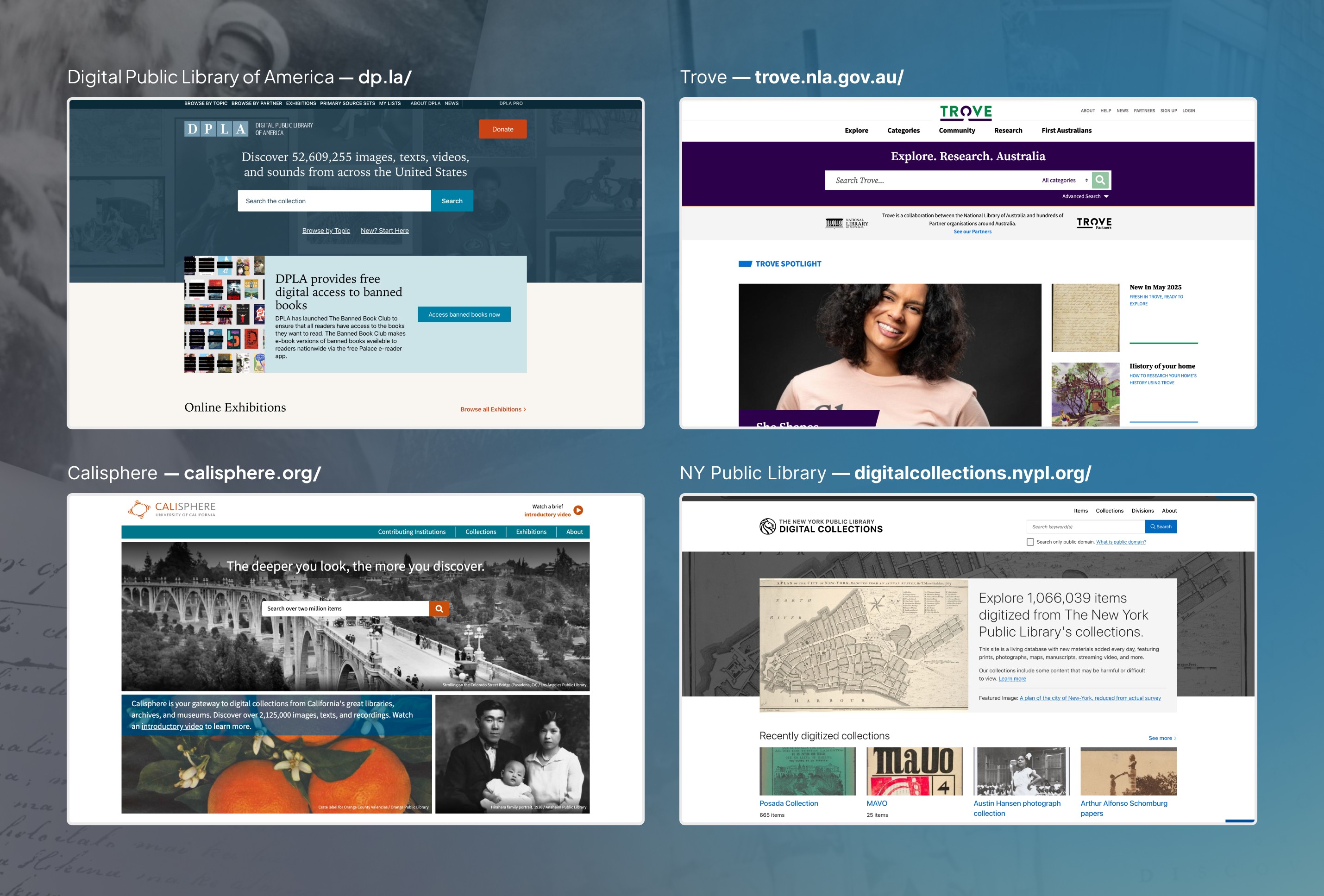
A list of four competitors to the Papakilo Database
A list of four competitors to the Papakilo Database
A list of four competitors to the Papakilo Database
A list of four competitors to the Papakilo Database
Redesigining a new structure
Redesigining a new structure
Redesigining a new structure
I explored various low-fi designs to create a structure for a "new" Papakilo Database based on insights I gathered from users so far.
I explored various low-fi designs to create a structure for a "new" Papakilo Database based on insights I gathered from users so far.
I explored various low-fi designs to create a structure for a "new" Papakilo Database based on insights I gathered from users so far.
I explored various low-fi designs to create a structure for a "new" Papakilo Database based on insights I gathered from users so far.

User flow sketches of accessing the search function
User flow sketches of accessing the search function
User flow sketches of accessing the search function
Design Solutions
Design Solutions
Design Solutions
Based on research, I focused on three core improvements. As the sole designer on this internal initiative, I was responsible for the complete visual system and all design decisions.
Based on research, I focused on three core improvements. As the sole designer on this internal initiative, I was responsible for the complete visual system and all design decisions.
Based on research, I focused on three core improvements. As the sole designer on this internal initiative, I was responsible for the complete visual system and all design decisions.
Based on research, I focused on three core improvements. As the sole designer on this internal initiative, I was responsible for the complete visual system and all design decisions.
SOLUTION 01
SOLUTION 01
SOLUTION 01
Streamline Search Paths
Streamline Search Paths
Streamline Search Paths
Four competing search methods created decision paralysis. Users didn't know which path would give them the best results.
Four competing search methods created decision paralysis. Users didn't know which path would give them the best results.
Four competing search methods created decision paralysis. Users didn't know which path would give them the best results.
Four competing search methods created decision paralysis. Users didn't know which path would give them the best results.
The Problem
The Problem
The Problem
The Problem
Four different entry points (by collection, by location, by newspaper, advanced search) forced users to choose a search method before knowing what they were looking for.
Four different entry points (by collection, by location, by newspaper, advanced search) forced users to choose a search method before knowing what they were looking for.
Four different entry points (by collection, by location, by newspaper, advanced search) forced users to choose a search method before knowing what they were looking for.
Four different entry points (by collection, by location, by newspaper, advanced search) forced users to choose a search method before knowing what they were looking for.
The Solution
The Solution
The Solution
The Solution
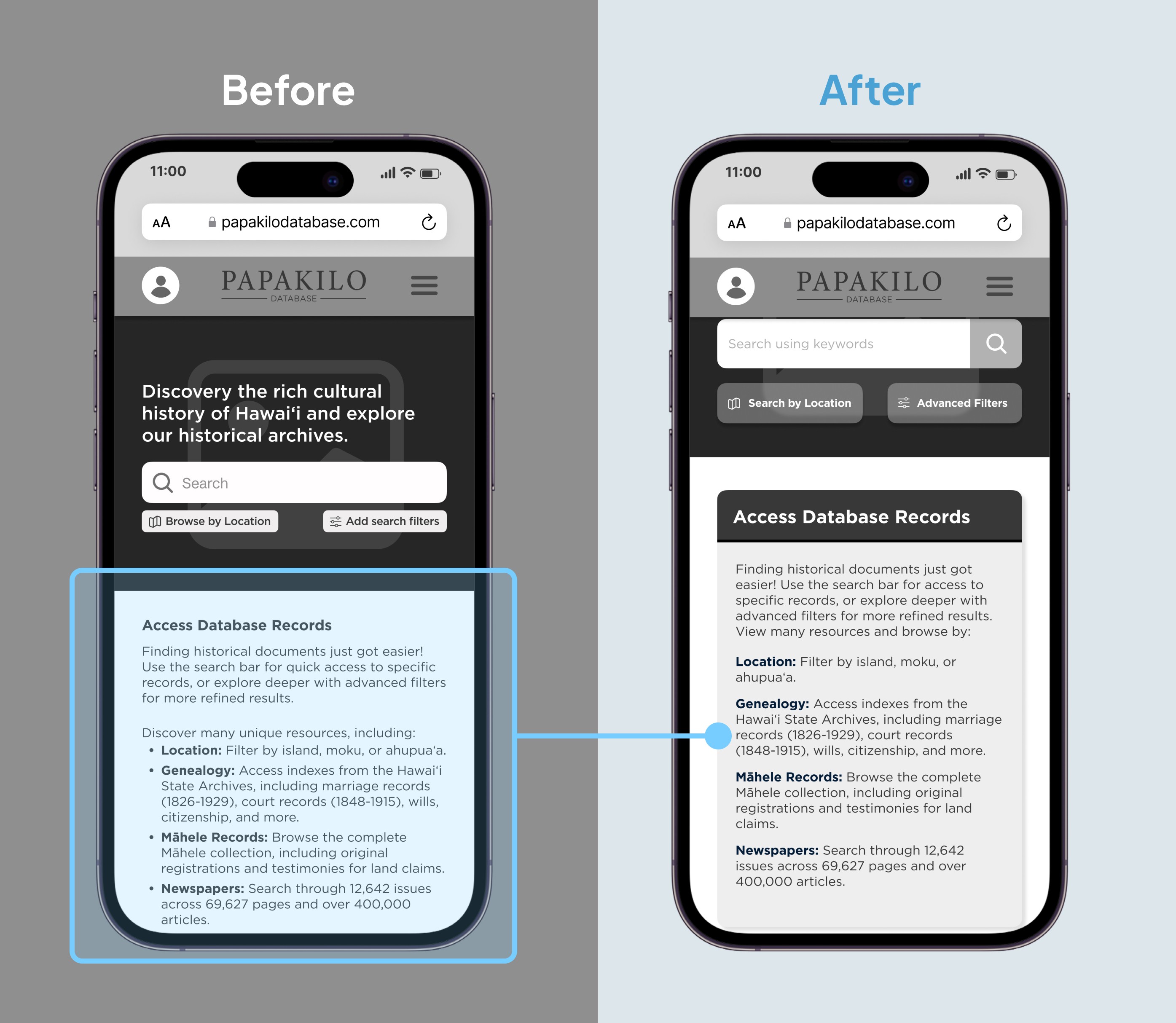
One centralized search bar with progressive filtering. Start with a simple query, refine as needed. As a result, the overall impact eliminated decision paralysis at the entry point. Users could begin searching immediately.
One centralized search bar with progressive filtering. Start with a simple query, refine as needed. As a result, the overall impact eliminated decision paralysis at the entry point. Users could begin searching immediately.
One centralized search bar with progressive filtering. Start with a simple query, refine as needed. As a result, the overall impact eliminated decision paralysis at the entry point. Users could begin searching immediately.
One centralized search bar with progressive filtering. Start with a simple query, refine as needed. As a result, the overall impact eliminated decision paralysis at the entry point. Users could begin searching immediately.
SOLUTION 02
SOLUTION 02
SOLUTION 02
Introduce Search Persistence
Introduce Search Persistence
Introduce Search Persistence
Even power users like Luci had to restart searches every time. No saved searches, no history, no way to build on previous work.
Even power users like Luci had to restart searches every time. No saved searches, no history, no way to build on previous work.
Even power users like Luci had to restart searches every time. No saved searches, no history, no way to build on previous work.
Even power users like Luci had to restart searches every time. No saved searches, no history, no way to build on previous work.
The Problem
The Problem
The Problem
The Problem
Every search started from scratch. No memory of what users had searched for, no saved parameters, no personalization.
Every search started from scratch. No memory of what users had searched for, no saved parameters, no personalization.
Every search started from scratch. No memory of what users had searched for, no saved parameters, no personalization.
Every search started from scratch. No memory of what users had searched for, no saved parameters, no personalization.
The Solution
The Solution
The Solution
The Solution
User accounts with saved search parameters, search history, and personalized recommendations based on collections accessed. Onboarding asks about research interests to surface relevant content upfront.
User accounts with saved search parameters, search history, and personalized recommendations based on collections accessed. Onboarding asks about research interests to surface relevant content upfront.
User accounts with saved search parameters, search history, and personalized recommendations based on collections accessed. Onboarding asks about research interests to surface relevant content upfront.
User accounts with saved search parameters, search history, and personalized recommendations based on collections accessed. Onboarding asks about research interests to surface relevant content upfront.
SOLUTION 03
SOLUTION 03
SOLUTION 03
Improve Information Architecture
Improve Information Architecture
Improve Information Architecture
Dense blocks of partner information and poor visual separation made the interface overwhelming.
Dense blocks of partner information and poor visual separation made the interface overwhelming.
Dense blocks of partner information and poor visual separation made the interface overwhelming.
Dense blocks of partner information and poor visual separation made the interface overwhelming.
The Problem
The Problem
The Problem
The Problem
Database partners displayed as undifferentiated text blocks. No clear way to scan for specific organizations or understand what each partner offered.
Database partners displayed as undifferentiated text blocks. No clear way to scan for specific organizations or understand what each partner offered.
Database partners displayed as undifferentiated text blocks. No clear way to scan for specific organizations or understand what each partner offered.
Database partners displayed as undifferentiated text blocks. No clear way to scan for specific organizations or understand what each partner offered.
The Solution
The Solution
The Solution
The Solution
Partners displayed as expandable cards organized by category, with clear visual hierarchy and breathing room between sections. "Latest updates" given more prominence for scannability.
Partners displayed as expandable cards organized by category, with clear visual hierarchy and breathing room between sections. "Latest updates" given more prominence for scannability.
Partners displayed as expandable cards organized by category, with clear visual hierarchy and breathing room between sections. "Latest updates" given more prominence for scannability.
Partners displayed as expandable cards organized by category, with clear visual hierarchy and breathing room between sections. "Latest updates" given more prominence for scannability.
Test + Refine
Test + Refine
Test + Refine
Validating design decisions
Validating design decisions
Validating design decisions
I conducted usability testing with 4 participants (different from initial research group) to validate functionality and assess intuitiveness.
User Task: Find a specific historical document using the redesigned search and filtering system.
Results:
4/4 participants successfully completed the task
Search time: ~5 minutes (compared to 20-25 minutes baseline)
80% reduction in task completion time
Refinements identified from testing
Refinements identified from testing
Refinements identified from testing
Testing revealed additional three areas for improvement that I iterated on before presenting to stakeholders:
Testing revealed additional three areas for improvement that I iterated on before presenting to stakeholders:
Testing revealed additional three areas for improvement that I iterated on before presenting to stakeholders:
Testing revealed additional three areas for improvement that I iterated on before presenting to stakeholders:
Menu navigation needed clearer pathways
Menu navigation needed clearer pathways
Menu navigation needed clearer pathways
Menu navigation needed clearer pathways
Primary change: Improved labeling and organization in navigation structure. Some users were unclear about how to access certain features.
Primary change: Improved labeling and organization in navigation structure. Some users were unclear about how to access certain features.
Primary change: Improved labeling and organization in navigation structure. Some users were unclear about how to access certain features.
Primary change: Improved labeling and organization in navigation structure. Some users were unclear about how to access certain features.

Spacing and visual hierarchy
Spacing and visual hierarchy
Spacing and visual hierarchy
Spacing and visual hierarchy
Primary change: Increased padding, clearer section breaks, larger type for headings. Sections needed more breathing room. Information felt dense and hard to scan.
Primary change: Increased padding, clearer section breaks, larger type for headings. Sections needed more breathing room. Information felt dense and hard to scan.
Primary change: Increased padding, clearer section breaks, larger type for headings. Sections needed more breathing room. Information felt dense and hard to scan.
Primary change: Increased padding, clearer section breaks, larger type for headings. Sections needed more breathing room. Information felt dense and hard to scan.
"Latest updates" section needed emphasis
"Latest updates" section needed emphasis
"Latest updates" section needed emphasis
"Latest updates" section needed emphasis
Primary change: Visual treatment to make it more prominent and scannable. Users wanted to see recent additions but were missing them in the layout.
Primary change: Visual treatment to make it more prominent and scannable. Users wanted to see recent additions but were missing them in the layout.
Primary change: Visual treatment to make it more prominent and scannable. Users wanted to see recent additions but were missing them in the layout.
Primary change: Visual treatment to make it more prominent and scannable. Users wanted to see recent additions but were missing them in the layout.

Validation
Validation
Validation
Identified a critical usability problem: Research with internal staff and external users confirmed that Papakilo's fragmented search experience created real barriers to accessing nearly 1 million cultural records. The cultural archivist's struggle wasn't isolated—it represented a systemic problem.
Reduced search time by 80%: Testing showed consolidated search and improved information architecture reduced task completion from 20-25 minutes to approximately 5 minutes, with 100% of participants completing tasks without assistance.
Created implementation roadmap: Developed comprehensive design specifications, style guide, and user flows ready for handoff when organizational capacity allows.
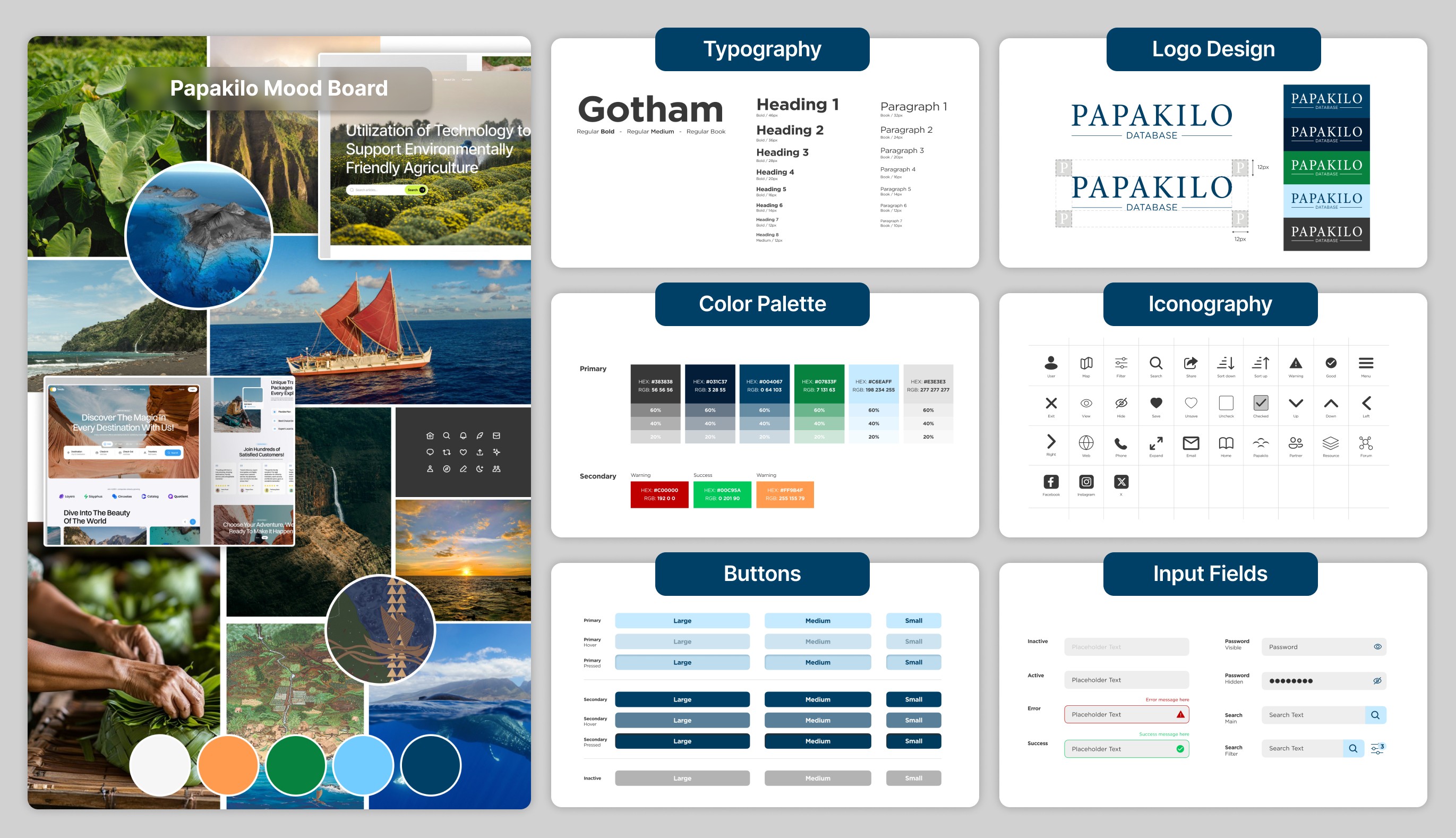
A built out style design guide for the Papakilo Database
A built out style design guide for the Papakilo Database
A built out style design guide for the Papakilo Database
A built out style design guide for the Papakilo Database
Why implementation was delayed
Why implementation was delayed
Why implementation was delayed
Did the redesign ship? TLDR; No, it did not because OHA was navigating executive leadership transition and budget reallocation.
While leadership agreed the redesign was needed, immediate implementation would have required:
Vendor procurement process (government agencies have formal hiring procedures)
Budget approval across multiple stakeholders
Development resources (no in-house dev team)
Timeline that competed with operational priorities
The outcome: This work established a documented need and created a foundation for future implementation when organizational capacity aligns with priorities.
Reflection
Reflection
Reflection
Key takeaways about UX in government
Key takeaways about UX in government
Key takeaways about UX in government
Design success depends on organizational readiness
Design success depends on organizational readiness
Design success depends on organizational readiness
Design success depends on organizational readiness
Strong UX work still requires alignment with budget cycles, priorities, and timing. This project helped formally surface Papakilo as a documented future priority, even without immediate implementation.
Strong UX work still requires alignment with budget cycles, priorities, and timing. This project helped formally surface Papakilo as a documented future priority, even without immediate implementation.
Strong UX work still requires alignment with budget cycles, priorities, and timing. This project helped formally surface Papakilo as a documented future priority, even without immediate implementation.
Strong UX work still requires alignment with budget cycles, priorities, and timing. This project helped formally surface Papakilo as a documented future priority, even without immediate implementation.
Incremental improvements are easier to fund than full redesigns
Incremental improvements are easier to fund than full redesigns
Incremental improvements are easier to fund than full redesigns
Incremental improvements are easier to fund than full redesigns
A phased approach would have reduced risk and demonstrated value earlier, making larger investments more realistic over time.
A phased approach would have reduced risk and demonstrated value earlier, making larger investments more realistic over time.
A phased approach would have reduced risk and demonstrated value earlier, making larger investments more realistic over time.
A phased approach would have reduced risk and demonstrated value earlier, making larger investments more realistic over time.
Research legitimizes UX in low-maturity environments
Research legitimizes UX in low-maturity environments
Research legitimizes UX in low-maturity environments
Research legitimizes UX in low-maturity environments
As the sole UX advocate, grounding recommendations in user research, expert insight, and competitive analysis was essential to gaining credibility.
As the sole UX advocate, grounding recommendations in user research, expert insight, and competitive analysis was essential to gaining credibility.
As the sole UX advocate, grounding recommendations in user research, expert insight, and competitive analysis was essential to gaining credibility.
As the sole UX advocate, grounding recommendations in user research, expert insight, and competitive analysis was essential to gaining credibility.
Cultural context shapes design decisions
Cultural context shapes design decisions
Cultural context shapes design decisions
Cultural context shapes design decisions
Designing Papakilo required understanding not just usability, but the cultural significance of genealogical and land records tied to Native Hawaiian identity.
Designing Papakilo required understanding not just usability, but the cultural significance of genealogical and land records tied to Native Hawaiian identity.
Designing Papakilo required understanding not just usability, but the cultural significance of genealogical and land records tied to Native Hawaiian identity.
Designing Papakilo required understanding not just usability, but the cultural significance of genealogical and land records tied to Native Hawaiian identity.
What I'd do differently
What I'd do differently
What I'd do differently
Validate power user workflows earlier
I prioritized simplification without fully validating how expert users relied on multiple entry points. More task-based testing would clarify whether consolidation removes critical workflows.
Tie usability to business impact
I focused on UX improvements without quantifying leadership-level costs like staff support time, lost engagement, or mission impact. Connecting design changes to these outcomes would strengthen advocacy.
Broaden internal research inputs
Research focused on database-adjacent teams. Including Research Division and Community Engagement would surface additional use cases and constraints.
Feel free to check out the Papakilo Database prototype
Feel free to check out the Papakilo Database prototype
Feel free to check out the Papakilo Database prototype
Feel free to check out the Papakilo Database prototype
please feel free to browse other case studies below!
please feel free to browse other
case studies below!
please feel free to browse other case studies below!
More case studies
More case studies
More case studies


open to
open to
Thanks for being here! If you want to work on a project together, please feel free to connect with me below.
Thanks for being here! If you want to work on a project together, please feel free to connect with me below.
Site designed by me + built in framer +
fueled by an açai bowl (with extra granola)
Copyright 2026 © Josh Koh
Product + Visual Design